
Your sales stack is full of screens. There are probably five dashboards at a minimum, and on a busy team closer to ten. Reps scroll past almost all of them, because none answer the question that matters most in the moment, which is whether a rep is on track today or quietly falling behind.
Almost all of those views document what already happened instead of shaping what happens next. They sit in a folder somewhere, updated weekly and seen by nobody. A handful of views work differently, because they change behavior the moment someone looks at them and they answer a question the reader can act on the same day. This guide covers those views and leaves the rest alone.
Key takeaways
- The test every dashboard view should pass: would anyone do something differently if the number moved? If no, it’s a vanity chart and it’s stealing attention you can’t spare.
- Leader and manager views answer forward-looking questions about where the number is going and what to do today. Rep-facing views build accountability and motivation by making progress visible in real time.
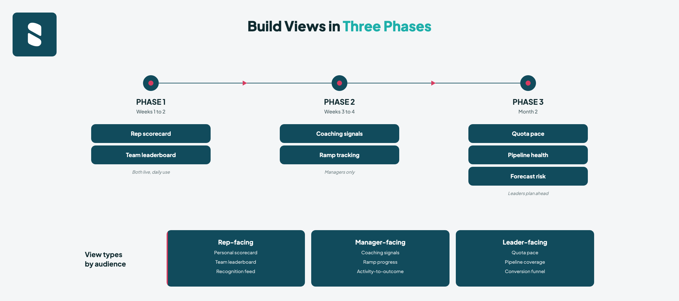
- The strongest setups build in three phases: start with rep scorecards and leaderboards (weeks 1 to 2), add manager coaching signals (weeks 3 to 4), then layer in the leader views (month 2).
- Keep each view to three or four metrics, match it to the audience, and feed it from live data. A view fed by manual entry is stale before lunch.
- Visibility is the starting condition, not the outcome. Views change performance only when they reach the right person in time and connect to coaching and recognition.
The one test every view has to pass
Before any view goes on a screen, ask whether anyone would do something differently if the number moved. If the honest answer is no, it’s a vanity chart, and it’s quietly costing you attention you can’t spare.
This matters more than it sounds, because the cost of clutter is real. Salesforce’s 2026 sales research found that sellers now juggle an average of eight tools to close a deal, that 42 percent feel overwhelmed by the sheer number of them, and that overwhelmed sellers are 45 percent less likely to hit quota. Stacking dashboards on top of dashboards adds to exactly that load. More screens don’t create more clarity. They create more places to look and more reasons to look at none of them.
The fix is to sort every view by who it serves and what it should trigger. Some views exist to help a leader decide, and others exist to change a rep’s behavior in the moment. A handful try to do both and usually do neither well. The cleanest way to think about it is the difference between tracking sales performance metrics and actually improving them, which is the difference between a dashboard that documents the past and one that influences the present. Every view below earns its place because it connects to a decision or an action rather than just a record.
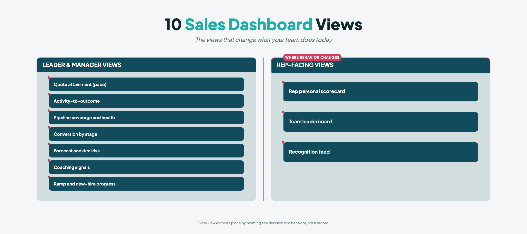
Leader and manager views answer a forward-looking question about where the number is going and what to do about it today.
Rep-facing views work differently, building accountability and motivation by making progress visible and recognizing it in real time.
The views that tell you where the number is going
These are the leader’s views. You aren’t trying to relive last quarter, you’re trying to spot early where this one is drifting, while you can still do something about it.
Quota attainment, shown as pace
Most attainment dashboards show a percentage against target and call it a day. The version that earns its place shows pace, telling you whether reps are on track to land the number at the current run rate or are quietly falling behind in a way that a month-end snapshot reveals too late. Pace turns a static figure into an early warning. It follows the same logic as breaking targets into bite-sized daily goals, where a rep who needs twenty meetings a month aims for one a day and can tell by Wednesday whether the week is on plan. Show the trajectory, not just the total.
The math behind it is simple. A rep who needs ten deals in a month should be sitting at around five by the midpoint, so a rep who has closed only three is pacing behind and tracking to finish near six unless the back half of the month changes. Seeing that on day fifteen gives you two weeks to act on it. Seeing it on day thirty only tells you what already went wrong.
Activity to outcome
This is the view that connects effort to results, and it’s the one most leaders skip. Calls, meetings booked, and pipeline added are leading indicators, while revenue and closed deals are lagging ones. By the time the lagging numbers move, the window to influence them has usually closed. A good activity-to-outcome view sits the two side by side so you can see which behaviors are actually producing pipeline and which reps are busy without being productive. Leading and lagging indicators each tell you something, but only the leading ones give you time to coach before the quarter is decided.
On a mid-market SaaS team, this view sits leading indicators like calls attempted, meetings booked, and pipeline created next to lagging ones like deals closed and revenue, rep by rep. A manager can see at a glance that one rep is making calls and booking meetings but converting almost none of it into pipeline, which is a skills conversation rather than a motivation one. Another rep might post low activity but an exceptional close rate, which means the fix is helping them prospect more, not coaching them on how to close.
Pipeline coverage and health
Coverage answers a blunt question about whether the team has enough live opportunity to hit the goal with realistic room for slippage. Health goes a layer deeper into where deals are sitting, how long they’ve been parked in a stage, and which ones have stopped moving. A pipeline view that only totals open value flatters you. One that flags the deals that haven’t advanced in two weeks tells you where to spend Thursday’s one-on-one. This is where AI-assisted pipeline management earns its place, reading deal velocity and stage conversion to catch an opportunity drifting toward a loss while the CRM still shows it sitting tidily in proposal.
Conversion by stage
A single team-wide win rate hides the thing you most need to see, which is where deals fall out of the funnel. Stage-by-stage conversion shows you the leak. If the drop is concentrated at one stage for one segment, that’s a coaching pattern rather than bad luck. This is why so many leaders are reframing their sales KPIs around conversion rates rather than raw activity counts. The point of the view isn’t to admire the funnel, it’s to tell you which conversation to fix.
On a sales-led finance team, the same view tracks conversion from prospect to qualified, from qualified to proposal, and from proposal to close. If reps convert prospects to qualified at 60 percent but qualified to proposal at only 20 percent, the leak isn’t in prospecting. It’s in the qualification or discovery conversation, and that’s where the coaching energy goes.
Forecast and deal risk
The forecast view is where optimism goes to be tested. The useful version doesn’t just roll commit and best-case into a number. It surfaces the deals carrying the most risk, the ones aging past your typical cycle, and the ones with no recent buyer activity. That matters more every year, because deals are spending longer in the pipeline than they used to, which means more of them sit in a state where they can stall unnoticed. This is also where Scout AI changes the role the dashboard plays. Instead of waiting for you to read the risk off a chart, it watches the patterns and flags a deal or a rep whose trajectory has diverged, so the conversation happens while there’s still time to influence the result.
The views that change what reps do
Here’s the part most dashboard guides leave out. The views above are genuinely useful, and not one of them changes rep behavior, because reps mostly never see them. A view built for management oversight and a view built to drive a rep’s day are two different things, and conflating them serves neither. The ones that follow are designed to be seen by the people doing the work.
The rep’s personal scorecard
A rep’s most important view is the one about them, covering their targets, their activity against those targets, their pace, and where they rank. When a rep can see their numbers in real time, they don’t need a manager to tell them they’re behind. The visibility itself creates the accountability. This is the heart of using data visualization to build goal awareness, where progress that is visible becomes progress people defend. A scorecard buried three clicks deep in the CRM gets checked once a week, while one that greets the rep on arrival works every hour.
The strongest rep scorecards are hyper-personal. They show the rep’s pace toward their own quota, their personal activity targets, their conversion rate compared with their own historical average, and their standing among peers in a way that gives context without turning into a public ranking. When a rep opens their laptop or checks their phone, the first thing they see is their own number, their own progress, and their own position, and that builds a daily habit of ownership.
The team leaderboard
A leaderboard isn’t a wall of shame, and it stops working the moment it feels like one. Done well, it shows current standings on the behaviors you actually want, updating live, which creates healthy competition around improving your position right now rather than reviewing it later. The trick is what you put on it. Ranking only on closed revenue discourages the newer reps who can’t win that race yet, so the strongest setups also celebrate the leading behaviors, ranking on activity and improvement rather than totals alone. A mid-market SaaS team running manual SPIFFs in a spreadsheet already understands the pull of a live standing, and the leaderboard just makes it visible and fair.
For an insurance agency, the leaderboard might rank advisors on new production, renewals closed, and personal production target attainment, with recognition lighting up whenever someone hits a milestone. For a bank, it might track cross-sell conversions or product penetration rates, surfacing which advisors are driving the most secondary product uptake. The behaviors you rank are the behaviors that get repeated.
Ramp and new-hire progress
Slow ramp is one of the quietest drains on a sales org, and most dashboards ignore new hires until they show up in the quota report months later. A ramp view measures a new hire against the cohort that came before them, comparing activity and early conversion at the same week in the ramp. A rep who’s behind on activity but ahead on conversion in week three needs help with prospecting mechanics, while one who’s behind on both is a different kind of problem. The point is that you see it in week three, when there’s still time to act, rather than in the quota report a quarter later. For a sixty to eighty user bank onboarding advisors across regions, that early signal is the difference between a quick correction and a lost quarter.
Coaching signals
This is the manager’s version of a rep-facing view, and it’s about patterns rather than standings. It surfaces the reps who are trending down by midweek, the ones posting high activity with low conversion in a way that points to a skill gap rather than an effort gap, and the deals that have sat in the same stage for two weeks. These signals rarely jump out of raw numbers, which is why real-time sales data matters more than a weekly report. Reps experience timely, specific coaching as support, and they experience a month-late review as surveillance.
A good coaching view flags the reps whose activity has dropped more than 20 percent from their own weekly average, the deals that haven’t moved in fourteen days, the reps sitting in the top tier for activity but the bottom tier for conversion, and the new opportunities that have lingered in early stages for more than twice the usual cycle time. Those are the Thursday conversations, the ones that change an outcome instead of getting buried in a Friday recap.
The recognition feed
The most overlooked view of all shows wins as they happen. A live feed of recent sales, milestones hit, and personal bests isn’t decoration. It’s reinforcement, and reinforcement is what turns a good week into a habit. This lands hardest in a multi-location setting. When an advisor in one branch of an insurance agency closes a renewal and it lights up screens in every other office, the recognition does work no quota chart can. It tells the floor what good looks like, it shows people what their peers across the network are hitting, and it makes clear that good work gets noticed. People repeat what gets seen.
Build these views in three phases
Teams that try to build all of these at once tend to abandon all of them. The cleanest path is to start with reps and build upward.
In phase one, weeks one to two, build the rep’s personal scorecard and the team leaderboard. Both are visible by default, both update live, and both move behavior by Friday. A rep who checks a scorecard every morning builds accountability without you saying a word, and a leaderboard that updates live builds competition without a monthly meeting.
In phase two, weeks three to four, add the coaching signals view for managers. It’s management-only; it feeds straight into one-on-ones, and it replaces scrolling through raw numbers with a clear read on which conversation to have on Thursday.
In phase three, the second month, layer in the forward-looking views, namely pace, coverage, and forecast risk, once the team is used to seeing themselves in real time. Starting with the rep-facing views builds the habit and the proof before managers invest in their own, so by the time the leader views arrive, reps already trust the data because they have lived in it for a month.
How to build this without adding a dashboard for everything
If your reaction to a list like this is to go build a dashboard for every item, stop. The whole point is fewer, sharper surfaces, each pointed at a decision or a behavior. Salesforce’s own guidance is to keep each view to three or four metrics, make it role-based, and review it quarterly so it keeps tracking what matters now rather than what mattered last year. A view that tries to show everything ends up showing nothing.
Feeding views from your data stack
The views above only work if they update in real time. This means connecting them to live sources such as your CRM, dialer, and product data rather than spreadsheets or weekly exports. Tools like SalesScreen pull from Salesforce, HubSpot, or similar APIs and push updates every fifteen to thirty minutes, so the scorecard and leaderboard reflect the day as it unfolds. If your views are fed by yesterday’s data, they stop changing behavior. Real-time visibility is table stakes.
Three principles make the difference
The first principle is to match the view to the audience, so reps see their own progress and managers see team patterns, and you never force one screen to do both jobs. The second is to push the view to where the work happens, whether that’s a wall screen, a mobile app, or the first thing a rep sees when they open their laptop, because a report that takes effort to find gets the effort it deserves, which is none. The third is to let the data flow from work reps are already doing rather than asking them to update a dashboard by hand, because a view fed by manual entry is stale and resented before lunch.
That last point is where the reinforcement layer earns its keep. The reporting and forecasting tools in your stack are good at telling you what happened. The job of turning visibility into action, putting the right number in front of the right person while they can still act on it, and recognizing the behavior the second it occurs, is a different job. It’s the one SalesScreen and Scout AI are built for. Your reporting stack tells you the score, and this is the layer that helps the team change it.
The view that earns its place
Dashboards aren’t the problem, aimless ones are. The views here share a single quality, in that each one points at a decision or a behavior, and the strongest of them put the answer in front of the rep while it still counts. Pick the views that change what your team does tomorrow, build them well, and let the rest go.
If you want to see what it looks like when visibility actually drives behavior, that’s the part SalesScreen handles. Take a look at how SalesScreen turns real-time performance into action, and bring the dashboards that already pass the test.
Frequently asked questions
What is a sales dashboard?
A sales dashboard is a visual view of your most important sales metrics, pulled from the CRM and your other tools and grouped so you can read performance at a glance. The useful ones do more than display numbers. They surface the specific signal a rep or manager can act on today, rather than a tidy record of last quarter.
What’s the difference between a sales dashboard and a sales report?
A report is a static summary of what happened over a fixed period, while a dashboard is a live view that updates as performance changes. The practical difference is timing. A report tells you what you can no longer affect, while a real-time view shows you something while you still have room to influence it.
Which sales dashboard metrics actually matter?
The ones that would change a decision or a behavior if they moved. For leaders, that usually means quota pace, activity-to-outcome, pipeline coverage and health, conversion by stage, and forecast risk. For reps, it means their own scorecard, their standing, and the leading behaviors that predict results. If a metric wouldn’t change what anyone does, it doesn’t belong on a front-facing view.
How many dashboards should a sales team have?
Fewer than most teams think. The aim is a small set of role-based views, each focused on three or four metrics, rather than a sprawl of overlapping screens. Sellers already report feeling overwhelmed by tool clutter, so adding dashboards for the sake of completeness works against you. Build for the decision, then stop.
How do I make reps actually use a dashboard?
Make it about them, make it visible without effort, and feed it from work they already do. A rep checks a view that shows their own pace, rank, and progress far more than one built for management oversight. Put it where they already look, keep it current automatically, and tie it to recognition so the view rewards the behavior rather than just recording it.
Can a dashboard improve sales performance on its own?
Not by itself. Visibility is the starting condition, not the outcome. A view changes performance only when it reaches the person who can act on it in time and connects to coaching and recognition. Measurement without reinforcement tends to document a problem rather than fix it.
