
How Data Visualization Drives Sales Performance and Rep Accountability
Data visualization for sales teams does more than organize reporting. When built correctly, it changes what reps do and how managers coach. This guide covers the behavioral case for sales data visualization and what actually drives performance.

Every sales team has dashboards. Most of them get checked on Monday morning, referenced in the weekly review briefly, and then quietly ignored until the following Monday. The data is technically visible. Nothing changes.
The problem isn't that sales teams lack data. It's that most visualization is built to answer questions nobody is asking during the week. Executives want quarterly summaries. CRM reports give managers a backward-looking picture that they already knew. Individual reps rarely see their own numbers unless they go looking, and most don't.
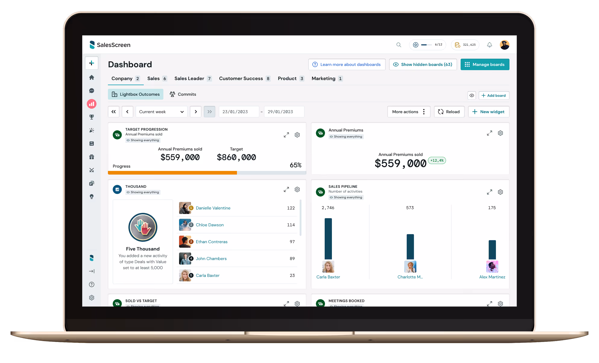
Data visualization for sales teams works differently when it's designed as a behavioral tool rather than a reporting one. The question isn't just what to display, but who sees it, when they see it, and whether it arrives while they can still act on it. That distinction determines whether your visualization infrastructure changes what reps do on Tuesday afternoon or simply confirms what you already knew at the end of the month. This guide covers the performance case for sales data visualization: why it changes behavior, what your team actually needs to see, and how to build a visibility system that drives results rather than just documents them.
Why Data Visualization Changes Behavior, Not Just Understanding
The standard argument for data visualization is that it makes complex information easier to understand. That's true, but it misses the more important point in a sales context. A better understanding of historical data doesn't move today's numbers. What moves today's numbers is a rep who sees where they stand right now and adjusts.
The behavioral mechanism is well established. Research from Harvard University found that people who actively monitored progress toward a goal performed 30% better than those who set the same goal without monitoring. The monitoring itself drove the performance gap, not the goal-setting. Data visualization is the infrastructure that makes. Continuous monitoring is possible without requiring reps to manually track anything. A related finding from Harvard Business Review found that visibility alone can lift individual performance by up to 12%, simply because people respond to transparency about their own progress. This effect doesn't require coaching, incentives, or additional management. The visibility does the work.
This is why the design of sales visualization matters as much as the data inside it. A report that sits in a CRM and requires effort to access might be read once a week. A dashboard that's visible on arrival, updated continuously, and personal to each rep creates a feedback loop that operates every hour. The format and placement aren't aesthetic choices. They're behavioral architecture.
What Sales Reps Need to See vs. What Managers Need to See
One of the most common visualization mistakes in sales is building everything for management. Pipelined dashboards for forecasting, activity summaries for oversight, and trend charts for quarterly planning. All of this is useful. None of it is what drives rep behavior. Reps and managers have fundamentally different information needs, and trying to serve both with the same display usually serves neither well.
What sales reps need
A rep's most important visualization is personal and current. They need to know exactly where they stand against their own daily and weekly targets, and how their activity this week. compares to their own previous pace, where they sit in the team standings, and whether they're behind, on track, or ahead. This information needs to be. visible without effort, ideally the first thing they encounter when they start their day or log into their tools. When reps have this picture continuously available, self-correction happens naturally. When they don't, it happens in a Friday debrief, which is too late to change the week.
What sales managers need
Managers need a team-level view that surfaces patterns rather than just aggregating numbers. Which reps are trending down midweek? Where is pipeline stalling? Who is producing high activity volume with low conversion, signaling a coaching need? This is a different visual language from individual rep dashboards. It's about early signals rather than current standings. The distinction between dashboards built for decisions vs. Dashboards built for reporting is what separates teams that use their data from teams that have it.
The practical implication is that well-designed sales visualization creates two parallel layers: a personal performance layer for reps that drives individual accountability and motivation, and a pattern-recognition layer for managers that makes coaching proactive rather than reactive. Both layers matter. Conflating them into a single view tends to do neither job well.
The Three Things Good Sales Data Visualization Does
When sales data visualization is working as a performance tool rather than a reporting one, it consistently does three things that generic dashboards do not.
1. It makes progress visible in real time
The motivational power of visible progress is grounded in psychology. Teresa Amabile's Progress Principle research found that the single strongest driver of positive emotion and motivation at work is making progress on meaningful work. The keyword is progress, not achievement. Reps who can see their activity. translating into pipeline movement, and pipeline movement translating toward quota, stay engaged through the long stretches between closed deals. Static reports that show only final outcomes miss most of the motivational surface area entirely.
This is why tracking sales goals through visualization works differently from simply setting targets. The display of ongoing progress against a goal activates the same psychological mechanism that makes progress bars on software installations strangely compelling. When people can see movement, they stay engaged with the process.
2. It activates healthy competition
Leaderboards and team feeds introduce a social dimension to performance that individual dashboards alone cannot produce. When reps can see where they stand relative to peers they respect, competitive instinct engages in a way that external pressure from management does not. never reliably does. Research from SHRM found that peer-to-peer recognition has a 35.7 percent higher impact on performance than manager-only recognition. The visibility of peer performance is a form of recognition in itself, confirmation that the goal is achievable and that the rep's effort is visible to the people they work alongside.
The design of the competitive layer matters. Leaderboards that only celebrate the top two or three performers can disengage the majority of the team. The most effective designs show relative movement and improvement alongside absolute standings, so that a rep who moved from eighth to fifth this week sees that progress acknowledged even if they're not leading the board.
3. It closes the recognition loop
Data visualization without a recognition layer is incomplete. When a rep hits a milestone, the raw data records the fact. What drives the behavior to repeat is the signal that the achievement was seen. TV screen celebrations, live feed notifications, and leaderboard movements serve a different function than dashboard numbers. They turn performance data into social currency. Recognition built into the visibility layer closes the loop between behavior and reward in a way that monthly review cycles fundamentally cannot.

What to Visualize: Leading Indicators Come First
The most common error in sales dashboard design is overweighting lagging indicators. Revenue closed, deals won, quota attainment. These are the outcomes everyone cares about, which is exactly why they make poor primary displays. By the time they change, the period that produced them is already over.
Leading indicators are what you can actually act on. Calls made, meetings booked, proposals sent, pipeline added this week, and deal stage progression. These are the inputs that predict outcomes, and they're the signals that allow both reps and managers to course-correct before results slip. Sales analytics built around leading indicatorsgive teams something to manage rather than something to explain after the fact.
A practical visualization framework for sales teams typically looks like this.
- Daily rep view: Activity progress against daily targets (calls, outreach, meetings). Personal and current. Visible on login.Updated continuously.
- Weekly team view: Individual standings against weekly targets, team leaderboard, pipeline added. Drives the competitive layer and peer visibility.
- Manager view: Activity trends by rep, pipeline stage health, and early warning signals. Pattern recognition rather than current standings.
- Milestone and recognition layer: Real-time celebrations for achievements, live feed of team activity. Closes the behavioral loop between action and reward.
Lagging indicators have a place in monthly and quarterly reviews, in pipeline forecasting, and in strategy conversations. They shouldn't dominate the displays that reps encounter throughout the working day.

The Most Common Sales Data Visualization Mistakes
Most sales teams that struggle to get value from their visualization have made one or more of the same structural errors. These are worth understanding before designing or redesigning a visibility system.
1. Building for the executive audience first
Revenue roll-ups, pipeline summaries, and win rate trends are valuable for leadership but irrelevant to the rep who needs to know if they're behind pace at noon on Wednesday. When visualization is designed top-down, it tends to produce impressive-looking dashboards that generate zero behavioral change at the rep level. The design process should start with the question: What does a rep need to see to perform better today?
2. Updating too infrequently
Daily or weekly refresh cycles undermine the feedback loop that makes visualization effective. If a rep checks their dashboard at 10 am and the data is from yesterday, the behavioral effect is minimal. Real-time updates are the prerequisite for the self-correction mechanism to work. This is operationally harder, but it's what separates visibility systems that change behavior from those that produce accurate-but-useless summaries.
3. Showing everything at equal weight
Dashboards that surface twenty metrics with equal visual prominence force reps to interpret which ones matter. Most don't do this. They scan briefly and move on. Effective visualization hierarchy: one or two numbers that dominate the display, with supporting context available beneath. This is the difference between a dashboard that gives a rep an instant read on their situation and one that requires analysis. The most effective sales dashboards are built around a decision, not a data dump.
Many sales teams treat data display and recognition as separate systems. Dashboards in one tool, shoutouts in Slack, contest results in an email. When these are fragmented, the recognition doesn't reinforce the data, and the data doesn't produce recognition. Integrating visualization and recognition into a single layer is what makes performance visible in the full sense: not just tracked, but acknowledged.
How SalesScreen Makes Sales Data Visualization a Performance Driver
SalesScreen connects directly to your existing CRM, including native integrations with Salesforce and HubSpot, and surfaces your data in real time across personal rep dashboards, team leaderboards, and shared TV screens. The design is deliberately split: reps get a personal performance view that updates continuously, managers get a pattern-recognition layer that surfaces early signals, and the whole team sees a shared competitive and recognition feed.
The gamification layer connects the visualization to motivation directly. Competitions run against live data. Milestone recognition fires automatically when reps hit targets. Leaderboard movement is displayed in a format that activates competitive instinct without generating pressure. The result is a team that tracks its own performance because the visibility system makes that tracking rewarding rather than administrative.
For managers, coaching conversations become grounded in current data rather than last week's report. The ability to spot a rep whose activity dropped midweek, or a deal that's been stuck in one stage too long, means interventions happen when they can still change outcomes, not after the quarter has been decided.
Frequently Asked Questions About Data Visualization for Sales Teams
What is data visualization for sales?
Data visualization for sales is the practice of presenting sales performance data in visual formats, dashboards, leaderboards, charts, progress bars, and team feeds, so that reps and managers can interpret it quickly and act on it in the moment. The goal isn't just readability. It's behavioral: effective sales data visualization changes what reps do during the day by giving them a continuous, clear picture of where they stand and what matters right now.
What data should a sales team visualize?
The most important data for day-to-day performance are the leading indicators: calls made, meetings booked, proposals sent, pipeline added, and activity pace against daily and weekly. targets. These are the inputs reps can act on. Lagging indicators like revenue closed and quota attainment belong in weekly and monthly review formats rather. than in the displays reps encounter throughout the working day. For a deeper look at what to include in a rep-facing display, see the guide on creating goal awareness through data visualization.
How does data visualization help sales performance?
Visualization improves sales performance through three mechanisms: it creates a continuous feedback loop between daily activity and progress toward goals, which keeps reps self-motivated and self-correcting without external pressure; it introduces healthy competitive visibility when team standings are displayed, activating peer motivation; and it enables managers to spot patterns early, turning coaching from reactive to proactive. The combination of personal visibility, peer context, and timely recognition is what separates visualization that changes behavior from visualization that simply records it.
What is the difference between a sales dashboard and sales data visualization?
A sales dashboard is one format of data visualization, typically a screen-based display of multiple metrics.Sales data visualization is broader: it includes dashboards, leaderboards, TV screen feeds, progress indicators, and milestone celebrations. The distinction matters because a single dashboard viewed occasionally has a weak behavioral effect. A visibility system that includes ambient displays, personal progress views, and real-time recognition creates a behavioral environment where performance is continuously present rather than periodically checked.
How do you make sales data visualization motivating, not just informative?
Four elements make visualization motivating rather than just informative. First, it needs to be personal: reps respond to their own progress data, not team averages. Second, it needs to be current: data that's a day old loses the feedback-loop effect that drives self-correction. Third, it needs peer context: showing where reps stand relative to teammates they respect activates competitive motivation in a way that individual dashboards alone cannot. Fourth, it needs a recognition layer: when milestones trigger visible acknowledgment rather than just updating a number, the behavior that produced them becomes more likely to repeat. These four elements together are covered in more detail in the guide to sales performance visualization and goal awareness.
Can sales data visualization reduce the need for micromanagement?
Yes, and it does so through a direct mechanism. When managers have real-time visibility into activity trends and pipeline health, they no longer need to gather that information through check-ins and status requests. The information is already there. Coaching conversations shift from information-gathering to actual development. For reps, continuous visibility into their own performance reduces the need for external accountability pressure, because the data creates self-generated accountability. This connection between visibility and reduced micromanagement is explored in more depth in the post on stopping micromanagement and building performance that lasts.
Visualization as Performance Infrastructure
The teams that get lasting value from data visualization are the ones that treat it as behavioral infrastructure rather than reporting software. The question isn't what data to collect. It's who sees what, when they see it, and whether the display is designed to create action or just awareness. When reps have a personal, current picture of their own progress, they self-correct.
When they have peer context, they compete. When they see their milestones acknowledged in real-time, the behaviors that produced them repeat. When managers have early signals rather than lagging summaries, they coach before outcomes slip. None of this requires more data. It requires building a visibility system where the right information reaches the right person at the moment it can still change something.