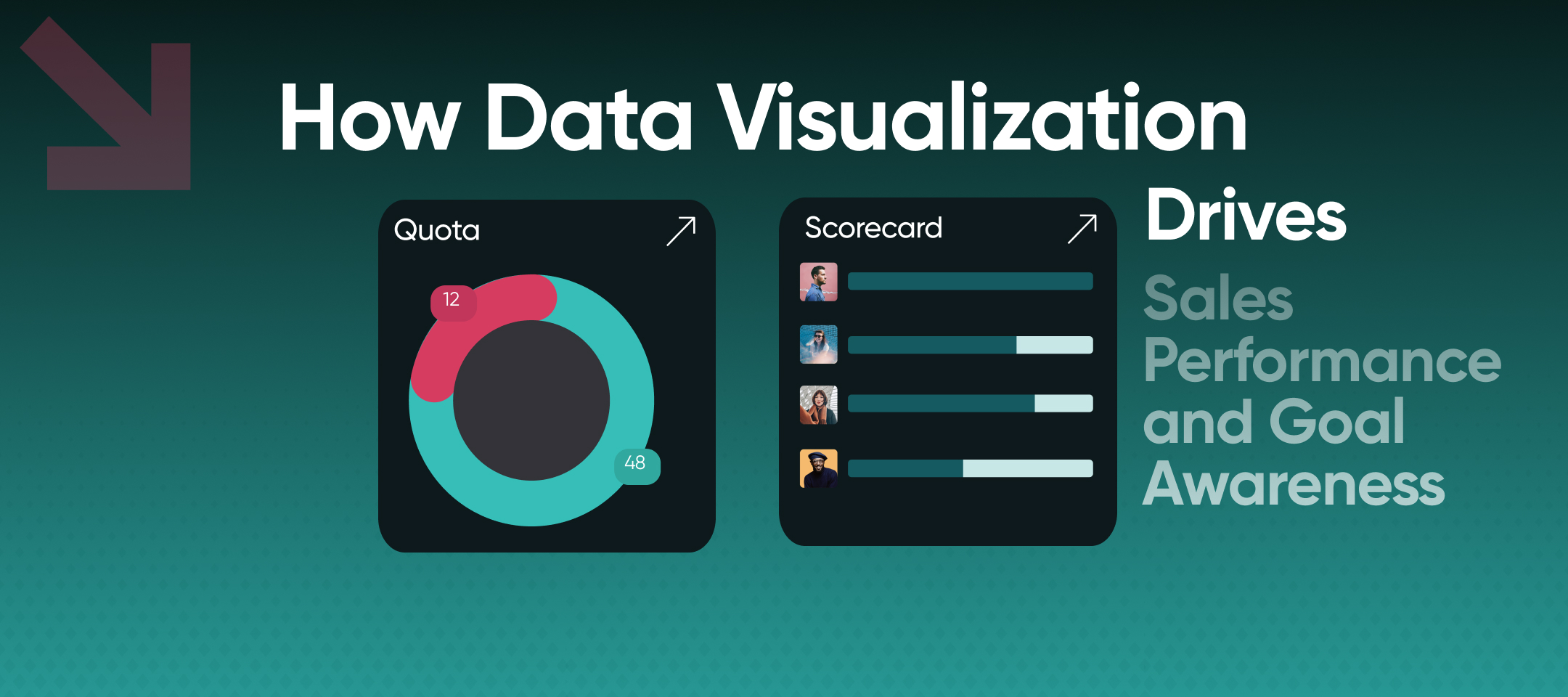
How Data Visualization Drives Sales Performance and Goal Awareness
Data visualization turns sales numbers into decisions. This guide covers how sales teams use real-time visualization to track goals, drive accountability, and keep every rep focused on what moves the pipeline.

Most sales data problems are not actually data problems. The data exists. CRMs are full of it. The problem is that the data sits in reports that managers pull at the end of the week, dashboards that only a handful of people check, and spreadsheets that are outdated before anyone opens them. By the time the information reaches the people who need to act on it, the moment to act has usually passed.
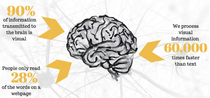
Data visualization changes that dynamic. Not because charts are more aesthetically appealing than spreadsheets, but because the human brain processes visual information fundamentally differently from text and numbers. Research consistently shows that roughly 90% of information transmitted to the brain is visual, and that visual data is processed significantly faster than written data. When performance information is presented visually and in real time, it becomes something people can act on rather than something they file away.
For sales teams specifically, the case for data visualization goes beyond general information processing. Sales is a performance environment. Visibility into where you stand against your goals, how your activity compares to your team, and which behaviors are driving outcomes is not a nice-to-have. It is the infrastructure that keeps people focused, competitive, and on track between formal review cycles.
What Data Visualization Does That Reports Cannot
Data visualization is the representation of information in graphical or visual formats, such as charts, dashboards, leaderboards, progress bars, heat maps, and other formats that make patterns and status legible at a glance. In a sales context, the goal is not visualization for its own sake. Itis about surfacing the right information to the right people at the right moment in a format they can use. The distinction between data and actionable data matters here. A spreadsheet showing a rep's call volume for the last 30 days is data. A real-time dashboard showing a rep's calls this week against their weekly target, alongside how they rank among peers, is actionable data. The difference is immediacy, context, and visibility.
There are three things data visualization does well in sales environments that other reporting formats do not:
- It creates awareness without requiring effort. When data is displayed continuously in shared spaces, whether on screens throughout an office or in apps accessible on any device, reps do not need to log into a report to know where they stand. Awareness becomes ambient rather than deliberate.
- It makes the connection between activity and outcome visible. One of the most consistent challenges in sales management is helping reps understand that today's prospecting calls are tomorrow's pipeline. When both activity metrics and outcome metrics are visualized together, that connection becomes concrete rather than abstract.
- It shifts accountability from manager-driven to self-directed. When reps can see their own performance data in real time, they do not need a manager to tell them they are behind. The visibility itself creates the accountability. Research from Gallup shows that employees who understand what is expected of them and can visualize their progress against those expectations are significantly more engaged. In sales, that engagement shows up in the daily behaviors that determine whether a team hits its number.
The Core Types of Data Visualization Used in Sales
Different visualization formats serve different purposes. Understanding which format fits which information need is what separates dashboards that people actually use from dashboards that become background noise.
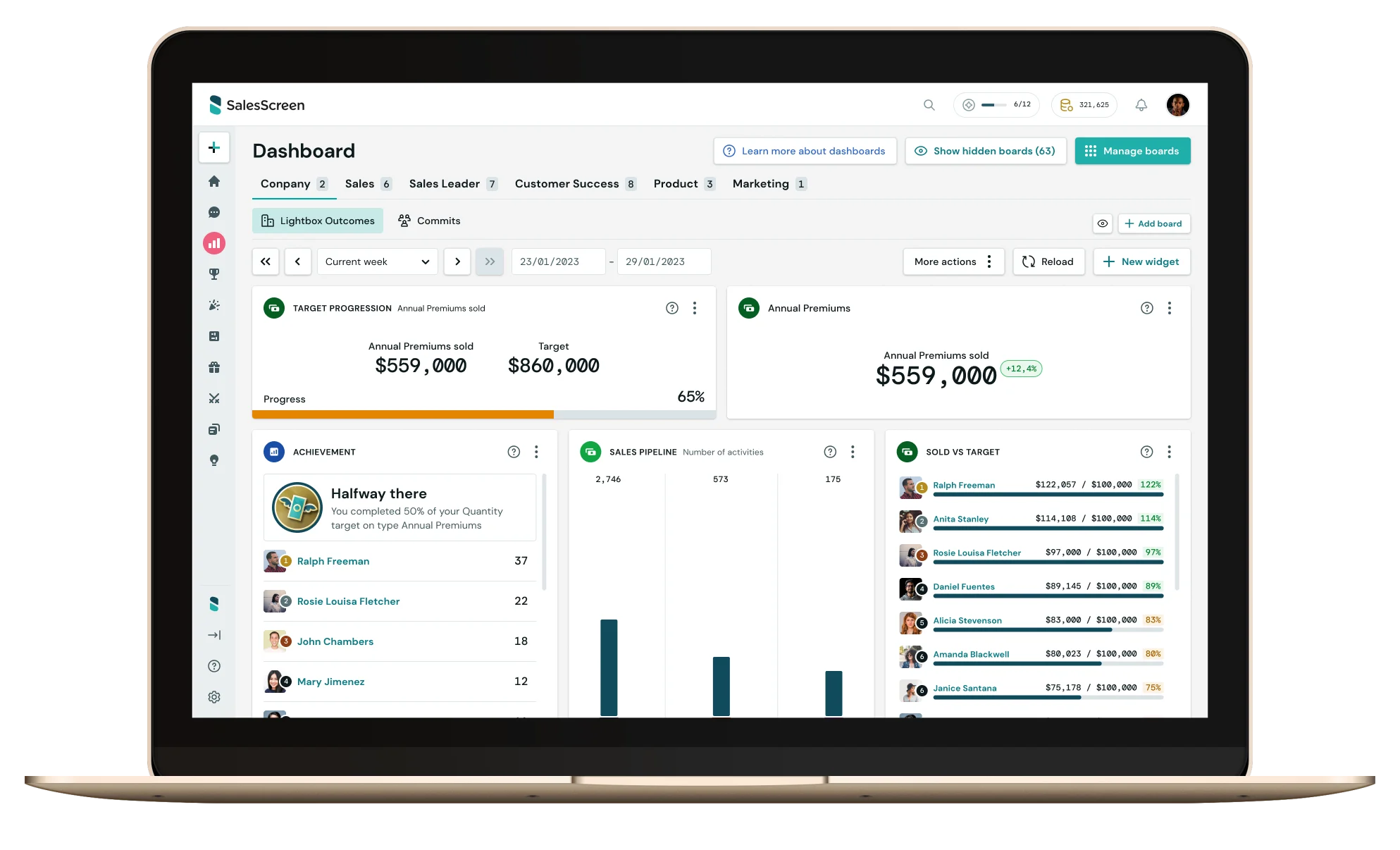
1. Sales Dashboards
A sales dashboard is the central visualization layer for most sales teams. It pulls data from the CRM and other tools and presents it as a set of visual metrics: revenue against target, pipeline health, conversion rates, activity levels by rep, forecast accuracy, and any other KPIs the team is managing to. The most effective sales dashboards are built around a clear principle: show the metrics people need to make decisions today, not the metrics that look impressive in a quarterly review. The practical question when designing a dashboard is whether each visible metric would change anyone's behavior if it moved. If not, it probably does not belong in a front-facing dashboard.
Dashboard design should also account for the audience. A rep's personal dashboard should show their individual targets, activity progress, pipeline status, and rank among peers. A manager's dashboard should show team-level performance, individual rep variance, pipeline health, and leading indicators that flag problems early. An executive dashboard should show aggregate performance against plan, with the ability to drill down where needed.
2. Leaderboards
Leaderboards are one of the most psychologically potent forms of data visualization in sales. They introduce social comparison, which activates competitive drive and makes individual performance legible in the context of the team. When a rep can see exactly where they rank and how far they are from the next position, the visualization creates a specific motivational pull that abstract reports cannot replicate.
The design of the leaderboard matters significantly. Leaderboards that only rank by revenue or closed deals create a static picture of outcomes that have already been determined. Leaderboards that rank by current-period activity, calls made this week, meetings booked this month, pipeline added this quarter, create competitive incentives around behaviors that every rep can influence right now.
There is also a middle-performer dynamic worth considering. Most leaderboard designs primarily reward and engage the top 10 to 20% of a team. Sales teams serious about lifting overall performance need visualization formats that create meaningful competition across the full distribution, not just at the top. Segmented leaderboards, milestone-based recognition, and streak tracking are approaches that bring the middle of the distribution into competitive engagement. For a closer look at how leaderboards shape team culture, see this guide on how to use sales leaderboards to influence company culture.
3. Progress Bars and Goal Tracking
Progress bars are among the simplest and most effective visualization tools available. A rep who can see that they are at 67% of their monthly target on the 15th of the month has a precise, visual understanding of their situation that a number in a CRM cannot convey with the same immediacy.
Progress visualization works because it frames performance as a gap to close rather than a score to observe. The bar is not just showing where someone is. It is implicitly showing how far they need to go and, by extension, what they need to do today. When progress bars are visible continuously, they create a persistent motivation to advance them that sustains behavior through the slower stretches of a month or quarter.
4. Real-Time Notifications and Celebration Screens
Beyond static dashboards, real-time event-based visualization connects individual actions to immediate recognition. When a rep books a meeting and a notification fires across team screens, or closes a deal and a celebration triggers on the office display, the feedback loop between behavior and recognition closes almost instantly.
That immediacy matters psychologically. Research in behavioral science shows that behavior followed by immediate positive feedback is significantly more likely to be repeated than behavior that receives delayed recognition. Real-time celebration screens are not just about morale. They are about reinforcing the specific behaviors that produce results, at the moment those behaviors occur.
How Data Visualization Creates Goal Awareness Across a Sales Team
Goal awareness is not the same as knowing your target. Most reps know their quota. Goal awareness is the ongoing, active understanding of where you stand against that target, what you need to do this week to stay on track, and how your current trajectory maps to the outcome you are working toward. The gap between knowing a goal and maintaining active awareness of it is larger than it seems. A rep who learns their annual quota in January and sees it again at their mid-year review has had their goal communicated to them twice. A rep who can see their progress against quarterly targets, weekly activity goals, and pipeline health in real time every day is operating in an entirely different cognitive environment.
Data visualization bridges that gap in three specific ways.
- First, it externalizes the goal. Rather than a number sitting in memory or a document opened periodically, the goal becomes a visible feature of the work environment. It does not need to be recalled. It is there.
- Second, it shows trajectory rather than just status. A dashboard showing a rep is at 40% of their monthly target on the 20th communicates something different from one that shows they have closed four of their last five qualified opportunities and have a pipeline projecting to 85%. Status tells you where you are. Trajectory tells you where you are going. Effective goal visualization shows both.
- Third, it connects individual performance to team performance. When a rep can see how their contribution moves the team's shared number, goal awareness acquires a social dimension. The goal is not just personal. It is connected to something bigger, and the visualization makes that connection visible.
What Separates Data Visualization That Changes Behavior from Data That Gets Ignored
Visualization that works shares a few consistent characteristics that distinguish it from visualization that becomes ignored noise.
- The data has to be current. Visualization based on yesterday's import or last week's CRM sync creates a false sense of clarity. Reps and managers stop trusting dashboards that are not reliable, and once trust is lost it is hard to rebuild. Real-time data connectivity is not a premium feature. It is the baseline for visualization that actually changes behavior.
- The metrics have to be ones people can act on. Revenue year-to-date is worth knowing, but it does not tell a rep what to do today. Activity completion rates, pipeline stage progression, and call-to-meeting conversion give people something to act on. The test for any metric in a sales dashboard is whether seeing it would change what someone does in the next few hours.
- The visibility has to reach everyone, not just managers. Visualization that lives primarily in manager reporting tools creates information asymmetry. When visualization is shared, whether on office screens, in team apps, or in individual rep dashboards, reps can self-manage rather than wait to be managed.
- Recognition has to be built into the visualization layer. Data without recognition is just reporting. When visualization systems are connected to milestone celebrations, peer acknowledgment, and public recognition for specific behaviors, the data becomes emotionally meaningful. People do not work harder because they can see a number. They work harder because the number connects to something that matters to them.
Tellix, a sales organization that implemented SalesScreen's visualization tools across their team, described the practical result simply:
"Everyone knows what to focus on and they perform better as a result. Everyone understands the progress on goals and how we are performing as a company. We definitely notice that our 'low activity days' now are what would count as normal or high activity days previously."
The floor of performance rises, not just the ceiling. That is what consistent goal visibility, built into the daily work environment rather than reserved for review meetings, actually produces.
Data Visualization for Sales Goal Tracking: A Practical Framework
Setting up effective data visualization for a sales team does not require a complex implementation. It requires clarity on a few foundational decisions.
Define what you are actually trying to visualize
Start with the three to five metrics that most directly connect daily behavior to the outcomes the team is accountable for. For most sales teams those will include some combination of prospecting activity, pipeline creation, conversion rates, and revenue progress. Avoid the temptation to visualize everything. Dashboards with twenty metrics end up measuring nothing.
Match the visualization format to the information need
Progress bars work for target tracking. Leaderboards work for competitive engagement. Line charts work for trend visibility over time. Real-time notifications work for behavior reinforcement. Choosing the right format for each metric determines whether the information actually lands.
Make the data visible in the work environment
Visibility that requires a deliberate login creates a barrier. The more passive the access, whether screens in shared spaces, persistent displays on rep devices, or push notifications for key events, the more consistently the information will reach the people who need it.
Connect visualization to recognition
Every milestone that appears in a visualization should have a corresponding recognition moment built in. When a rep hits their weekly call target, that achievement should be visible to the team, not just to the rep. Visualization and recognition work together: the data shows what happened, the recognition signals that it mattered.
For a deeper look at how goal-tracking visibility connects to the broader performance management system, see this overview of how sales analytics can direct performance rather than just report on it.
How SalesScreen Makes Sales Performance Visible in Real Time
SalesScreen's visualization layer is designed around the principle that performance data should be ambient rather than retrievable. Rather than requiring reps and managers to pull reports, the platform surfaces performance information continuously across dashboards, leaderboards, TV displays, mobile apps, and real-time celebration notifications.
The integration with CRM systems means that data flows into the visualization layer automatically, keeping leaderboards, progress bars, and goal-tracking dashboards current without manual updates. Managers can configure what metrics are displayed, how they are prioritized, and which milestones trigger recognition events, so the visualization reflects the specific behaviors the team is coaching to rather than generic sales metrics.
Scout AI, SalesScreen's behavioral intelligence layer, adds a predictive dimension: rather than only showing where reps are now, it surfaces patterns and flags early when trajectory suggests a rep or a deal is at risk. That moves the visualization from descriptive to actionable, giving managers the information they need to coach proactively rather than reactively.
Rogaland Sparebank, which has used SalesScreen since 2017, described the impact on goal focus and recognition after six years:
"SalesScreen allows us to easily focus on new campaigns or different targets throughout the year with competitions, slides, countdowns, and other features. Now, it is very easy to get concentrated effort from everyone on our goals. Also, it gives the management team the ability to place a spotlight on individual goals or progression throughout teams."
Performance data that lives in a report gets reviewed. Performance data that lives in the work environment gets acted on. See how SalesScreen makes sales visibility continuous.
Frequently Asked Questions About Data Visualization for Sales
What is data visualization in a sales context?
Data visualization in sales is the representation of sales performance data, including activity metrics, pipeline health, goal progress, and revenue tracking, in visual formats such as dashboards, leaderboards, progress bars, and real-time displays. The purpose is to make performance information immediately legible and actionable for both reps and managers, rather than requiring them to interpret rows of CRM data.
What is the goal of data visualization for sales teams?
The primary goal is to close the gap between data and action. When sales performance information is visible in real time, reps can self-manage their activity, managers can coach proactively, and the team maintains consistent goal awareness throughout a period rather than only at reviews. Secondary goals include accountability, competitive engagement, and recognition for the behaviors that drive results.
How does data visualization improve sales performance?
Visualization improves sales performance by making the connection between daily behaviors and outcomes explicit and visible. When reps can see their activity levels against their targets in real time, and can see how those activities are progressing their pipeline and revenue numbers, they have the information they need to course-correct without waiting for a manager to flag a problem.
What types of data visualization work best for sales goal tracking?
The most effective formats for sales goal tracking are progress bars for individual target tracking, leaderboards for competitive team engagement, pipeline funnel visualizations for deal stage management, and real-time dashboards for at-a-glance performance status. Real-time notification systems, such as celebration screens for milestones, add a recognition layer that connects visualization to motivation.
How is a sales leaderboard different from a standard performance report?
A performance report is a static document that summarizes what happened over a defined period. A leaderboard is a live visualization that shows current standings and updates as performance changes. The psychological effect is different: a report tells you what happened; a leaderboard shows you what is happening and creates competitive incentives around improving your position right now.
What should a sales performance dashboard include?
A well-designed sales performance dashboard should include current activity metrics against targets, pipeline health and progression by stage, revenue progress against quota, individual and team rankings for key behaviors, and any leading indicators the team is managing to. The principle is to show the metrics that would change someone's behavior if they moved, not the metrics that simply document historical performance.
When Data Visualization Becomes Part of How a Team Operates
The shift data visualization makes in a sales environment is not primarily about charts being easier to read than spreadsheets. It is about what happens to goal awareness and accountability when performance information is present continuously rather than periodically.
When reps see their targets daily, they think about them daily. When their activity is visible to the team, social accountability operates continuously. When milestones are recognized publicly in real time, the connection between effort and reward is felt in the moment rather than at the end-of-month review.
That is the practical value of data visualization for sales teams: it brings the future into the present, making quarter-end targets feel like today's decisions rather than something that will be reckoned with later.