Sales is a numbers game. The more activity you create, the more likely you are to close a deal. If you’re not dialing, booking meetings, attending events, shaking hands and keeping busy, your chances of closing a high volume of sales drastically decrease. The sales profession isn’t for everyone… it’s for highly motivated team players who like the thrill of the chase. You’ve got to be outgoing, enthusiastic, likeable and honest. But even if you have it all together, you need to know where you stand.
Using leaderboards and data visualization slide on TVs throughout the office are a great way to keep everyone informed, aware of their progress and motivated to tackle their targets. People are naturally driven to achieve goals; so, when you make their goals very clear and constantly visible, they are much more likely to achieve them.
So, here are a few of our personal favorites and why we use them:
Revenue Progression

This simple slides shows a circle graph that measures revenue in real-time. We use it for monthly, quarterly and yearly revenue because as a bootstrapped software startup, we like to see where we stand and how our product is growing. Personally, this is my favorite slide because all I have to do is glance up and see exactly how we are performing on our total quota for a given time period. Simple, effective, self-explanatory.
New Monthly Recurring Revenue (MRR)

MRR is perhaps the most important revenue metric for any subscription-based business. It also allows you to keep a close eye on metrics such as retention and churn. We use this slide as a leaderboard to sort by user on weekly, monthly and yearly MRR results. This way, we know which reps are not just bringing in revenue, but the most important type… recurring revenue. The system also updates when users unsubscribe, so we can keep a close eye on our exact numbers in real-time. Can your software do that and put it on TV screens?
Last 10 Updates

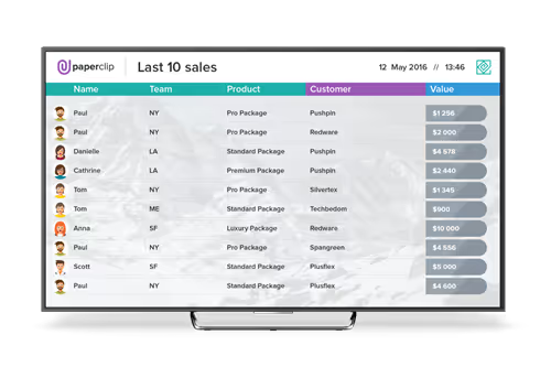
We use this slide to display the last 10 sales made, along with the seller’s name, team/location, product sold, customer name and total value. This way, we can easily see all of the most important information for recent sales all in one place. Plus, it’s a huge motivation boost to look at this slide and see big name customers, high sales values or which office is taking the lead in generating new revenue.
Company Feed

While not technically a single metric, this slide shows all of the recent updates within the company feed and usually runs for about 25 seconds. This slide shows all of the most recent reports in order and recognizes each person who completed them. Whether it’s sales, activities, offers, meetings, or just social chat and engagement, they show up hear to bring a fun vibe to the office and keep everyone informed.
Gamification Slides

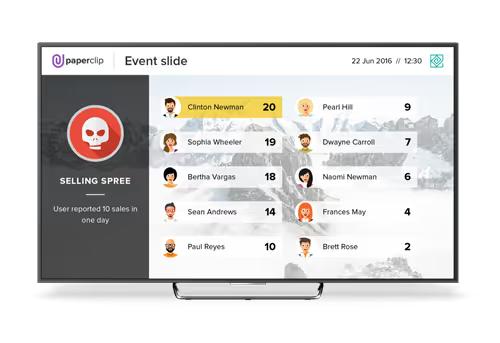
Since we make it possible to unlock badges for completing key activities, it’s fun to keep track of who has completed which milestones and how many times. Plus, it allows us to quickly sort achievements. In total, we have about 30+ badges and awards to unlock within our company this year and we only show some as a slide on TVs. Here are some examples of the gamification slides we use:
- Takeoff — User closed their first sale of the week
- Guardian Angel — User with the most customer support requests taken that day
- MVP Week — User who activated the most new licenses during the week

